
Here’s a confession: I wasn’t always a big fan of colors.
(Boy, that was harder to say out loud than I imagined.)
I know, I know, sounds like I’m some Cruella de Vil. Who wouldn’t like colors? They’re so adorable.
Don’t get me wrong, I love colors. Now. It’s just that among all the things you get to work with in design (typography, images, layouts), dealing with colors was a bit overwhelming for me back when I started my design journey.
Fortunately, I developed a few strategies to get that part nailed.
One part of that: my Colors First Aid Kit.
This is a collection of tools and resources I go to every time I feel that colors are taking over my head.
And I want to share 7 of these with you. These are the ones I take with me everywhere I go.
Adobe Color
Ok, let’s start with Adobe’s web for all things color.
If you go to color.adobe.com you’ll see a whole site dedicated to colors. But what’s really in my aid kit is the Create section.
Which has 3 tools that I love.
Let me briefly introduce you to each one:
The Color Wheel Tool
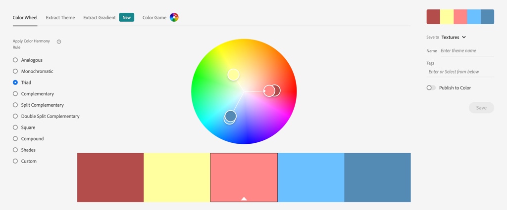
A nice color wheel and a bunch of color harmonies to pick from.
It’s a great tool if you’re building a color palette for a design project and want to build it around a specific color harmony.
Just select a base color, pick a harmony, move the little circles around if you need, and you’ll get a fully functional color palette for your design.
Next one:
The Extract Theme Tool
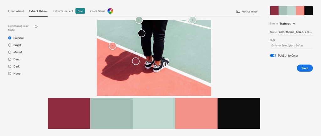
Another great way to start a color scheme from.
It lets you upload an image and create a color palette based on the colors from that image.
What I like the most about the Extract tool is that it doesn’t just throw you colors it finds on the image but it also lets you select specific points in the image itself from where to grab the colors AND also choose a mood for your palette, from colorful to muted and dark.
It makes my heart smile, it really does.
And finally…
The Extract Gradient Tool
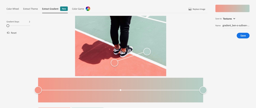
Same thing, just with a gradient. Upload an image and build a gradient from the colors in it.
Access all the tools here: color.adobe.com
Color Hunt
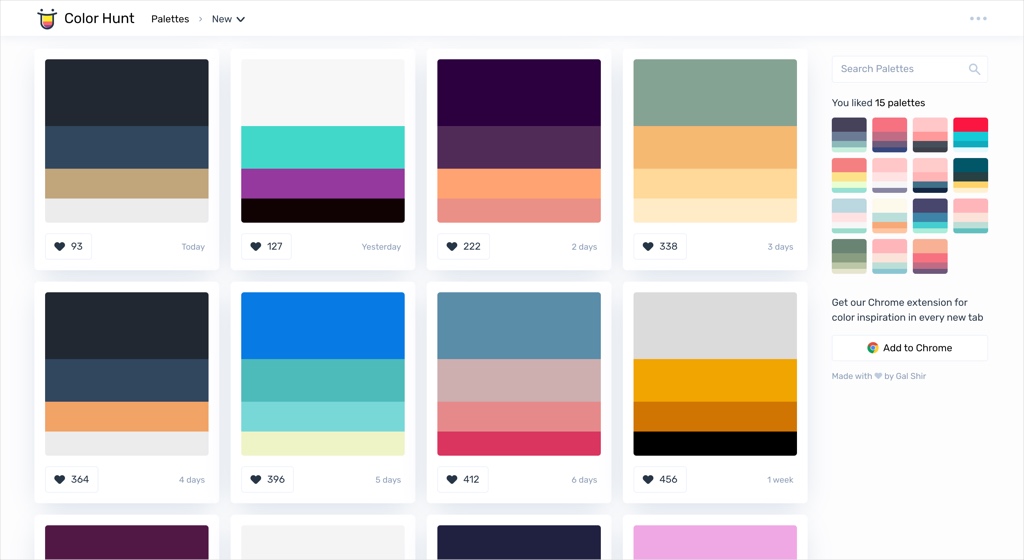
Do you know Gal Shir already? Well, besides being a super talented illustrator, he also created this open platform for color inspiration I can easily spend hours browsing.
Color Hunt has thousands of hand-picked color palettes with all kinds of moods, for all types of purposes.
And what’s especially useful is that you can browse all the palettes, mark those you like, and the site will save them for you on the side so you can have all your liked palettes together whenever you want them.
Go take a look: colorhunt.co
Color Claim
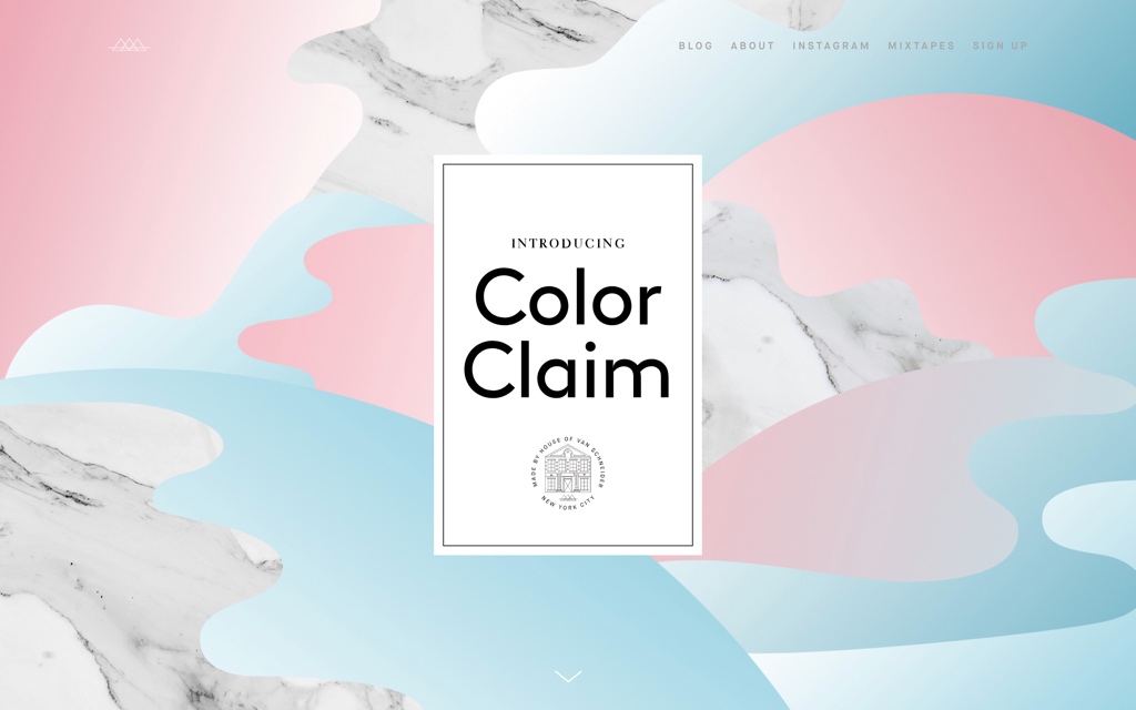
Color Claim is a small site by the great designer Tobias van Schneider that showcases a collection of unique color combinations.
These are mostly built with 2 colors: a main color and an accent color.
So simple. So beautiful. So useful.

You can pick a combination you like and use it for any project by copying/pasting the image with the combination into your design app (and grabbing the colors from it), or by downloading all the palettes together into Photoshop, Illustrator or Sketch.
Did I say I love’em?
Check it out: vanschneider.com/colors
Chroma.js
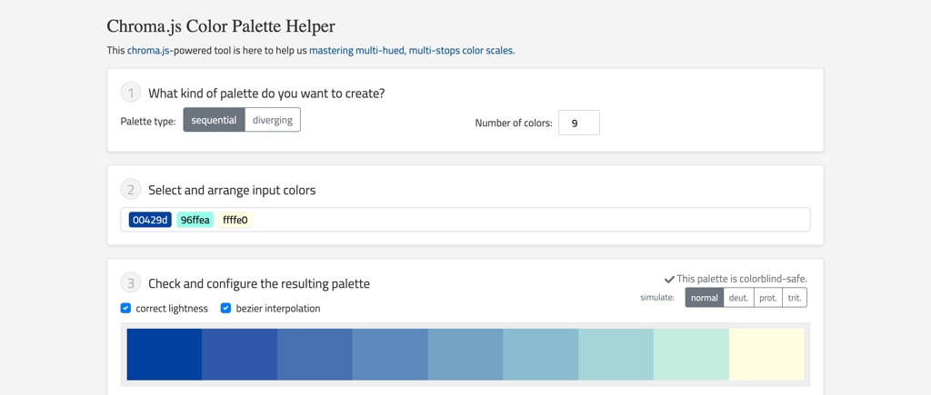
Here’s one of my newest additions to the kit. I think you’ll appreciate having it at hand too.
It’s called Chroma.js, and it’s a simple tool to help you create color scales.
“Why do you need color scales?” you ask.
Well, sometimes you need lighter or darker hues of a color you’re working with. Or you may want to mix two colors and see what comes out of that.
Kind of when you want to figure out what would come out of a mix between Jake Peralta and Charles Boyle.
Which, if you were wondering, is this:

For the first scenario, what you’ll do is put in the tool 3 colors:
Black (#000000) + The color you’re working with + White (#ffffff).
This will give you new colors between black and your color (darker than your color), and white and your color (lighter than your color).
For the second scenario, just enter your base color and any other color you want. Or even 3, or 4. You can go nuts with this.
In short, if you’re working on a design and you feel like you could use some new shades without abandoning your palette… this is one of the best places to go to.
Go get it here: Chroma.js
0to255
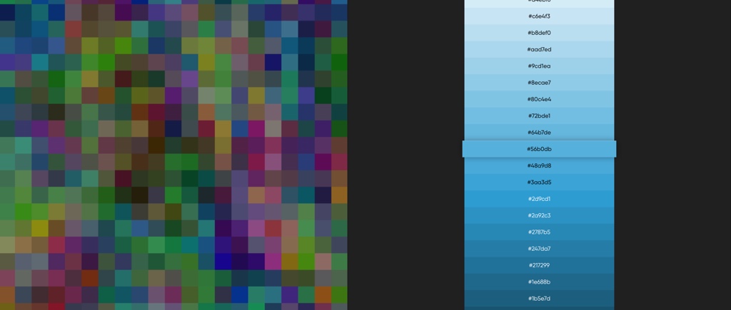
0to255 is similar to Chroma.js, just much simpler to use.
You enter a color code and the tool gives you a list of lighter and darker colors, from black to white. Then you click on the color you want to use and the hex code will be copied to your clipboard so you can use it anywhere.
Super useful: 0to255.com
* The difference between 0to255 and Chroma.js?
Great question. I’ll try to explain.
While 0to255 uses a linear variation of lightness to built the color scale, Chroma.js adds a hue variation to the mix, which provides a different result, with better contrast between the colors on the scale.
Most of the times I find the multi-hued scale (the one Chroma.js uses) much more harmonious and useful. But hey, give both a try and you’ll see which one works best for you each time.
Brand Palettes
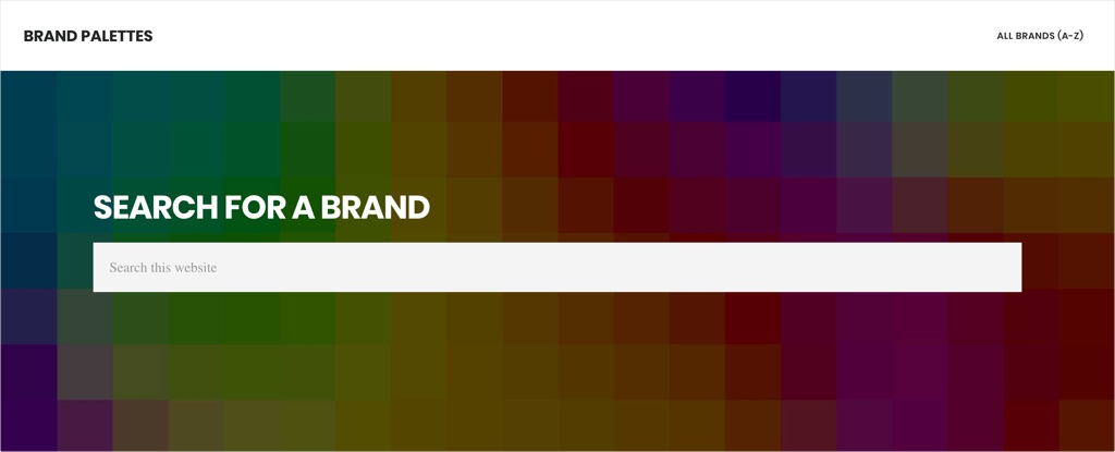
This one’s pretty simple.
Let’s say you’re adding social icons to a website and you want them to use the original colors of their brands. Facebook icon in Facebook’s blue, Spotify icon in its classic green, etc.
Instead of looking for these brands’ style guides, you go to brandpalettes.com, look for the brand you want and they’ll give you the colors you need to use.
Easy peasy.
Oh, and you can also use it as a learning resource: how popular brands build their color palettes it’s absolutely something worth taking a look at.
SchemeColor
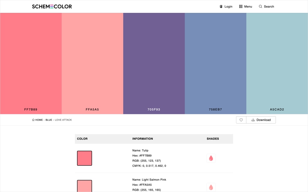
Finally, SchemeColor. This is the site I’d go to if I need to grab a ready-made palette and start working with it right away.
Not only because it has LOTS of inspiring palettes to browse -which it does-, but also because it offers some other useful perks too:
Their Color Scheme Generator lets you quickly generate color palettes based on different topics such as Love, Rustic, Fire, Sunset, Halloween, Matte, Skin (and these are just a few of them).
Also, they have a Color Tester tool which is a great way to evaluate how two colors will work together.
And last but not least, there’s the Color Code Converter tool which is some sort of fortune teller: you enter any color and it tells you all about it (well, not all, but most of you’ll want to know).
Get a taste of all their tools here: schemecolor.com
So… Who doesn’t like colors now? 🙂
Which tools are in your designer’s backpack?
Great insights! I didn’t know about the gradient tool, will be using that for my paintings.
Def going to make use of color claim too.
I’m so happy to read that, Nabeelah 🙂
I will check, thanks for sharing.
I would add for the easy of use Coolors https://coolors.co/
Stefano
Thanks Stefano, that’s absolutely a great tool too!